Plate 001 · Cover
Message Editor · 2025

The modern message editor — full-screen, responsive, and the proving ground for AWeber UI.
Fig. 01
Modernizing the core experience for small business communication — a decade-long evolution from constrained legacy tool to the foundation of an entire design language.
For small businesses, the ability to reach their list is existential. Their editor had to feel effortless — and it didn't.
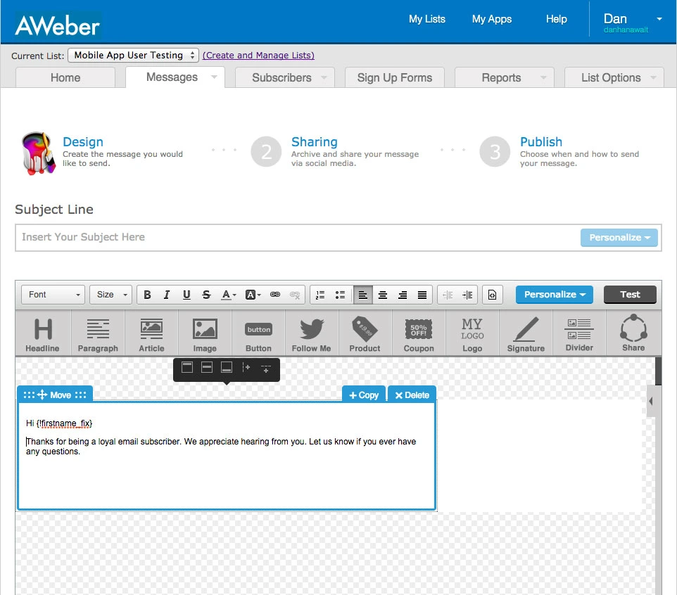
For small businesses, the ability to communicate with their audience is existential: if you can't reach your list, you can't sustain your business. AWeber's message editor was once a pioneering tool, but by the mid-2010s it had fallen behind both customer expectations and competitive benchmarks.
The editor was constrained to a fixed, narrow window, cluttered by system menus and notification bars that pushed the editing canvas almost below the fold. The experience felt clunky and outdated — undermining AWeber's value proposition at the very moment when email creation, the product's most essential task, needed to feel effortless and inspiring.
Competitors were offering cleaner, more immersive editors. There was real risk of losing both new and long-term customers if AWeber didn't modernize.
A decade-long arc — pitching the redesign, drawing the first wireframes, then setting the vision for the team that carried it forward.
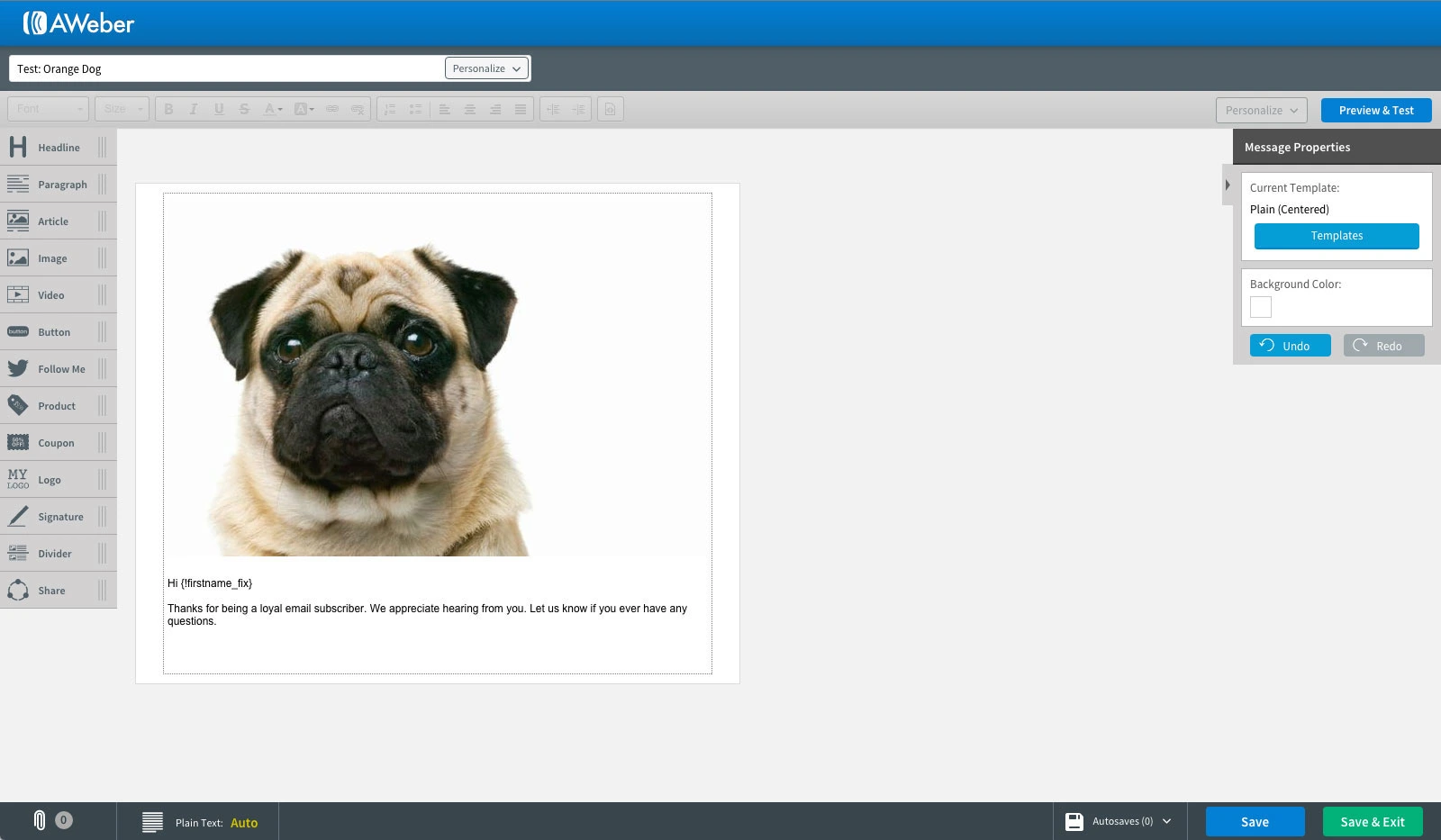
I identified the opportunity, pitched a modernization plan to product leadership, and designed the initial full-screen, self-contained editor. From the beginning, I designed it with responsiveness and mobile-first principles in mind — something the legacy editor could not accommodate — so the foundation would be flexible enough for continuous improvement.
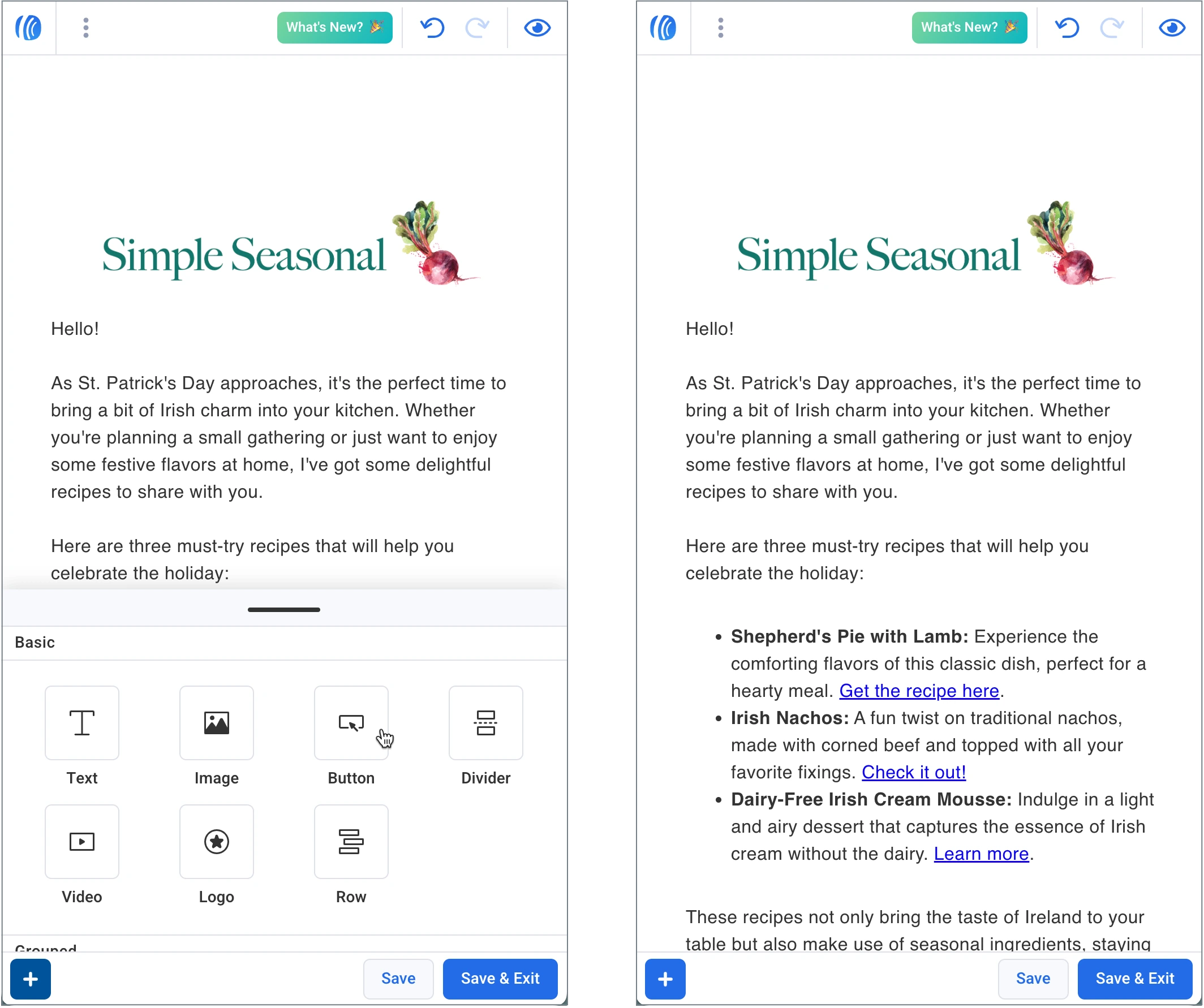
I set the vision for continued modernization, evolving the editor alongside our design system (AWeber UI). I guided my team through critiques, reviews, and refinements to ensure consistency as the editor matured into a cornerstone experience across both desktop and mobile.
Not a cosmetic update — a reset of AWeber's most critical experience, structured to compound over time.
Positioned the editor redesign not as a cosmetic update, but as a reset of AWeber's most critical experience — giving small business owners modern tools to communicate with confidence.
Anticipated the need for mobile optimization from the start, ensuring the new editor could scale seamlessly across devices and adapt to emerging design standards.
Delivered a full-screen, focused environment that reduced distractions and put content creation at the center of the workflow.
Established design patterns that went on to influence other AWeber editors — including the landing page editor and later the Workflows builder — unified through the AWeber UI design system my team has evolved over several years.
Structured the work so improvements could roll out in manageable phases, proving value early while setting the stage for longer-term transformation.
Transitioned from individual execution to team leadership, ensuring design quality, customer empathy, and strategic goals remained aligned across years and team turnover.
The editor became the proving ground for AWeber UI — a design system that continues to unify product experiences and accelerate development.
The redesign transformed a dated, frustrating workflow — and reinforced AWeber's reputation in a competitive landscape.
The editor's longevity, centrality, and influence on subsequent product experiences underscore its sustained strategic value as the foundation for AWeber's modern design language.
Writing and designing emails became faster, easier, and accessible across devices — directly strengthening the communication lifeline of their businesses.
The redesign revitalized AWeber's core differentiator, and its design language set the precedent for other flagship tools, creating consistency across the platform.
The editor became the proving ground for AWeber UI — a design system that continues to unify product experiences and accelerate development.
Pre-2015 legacy, the initial redesign, and the 2025 editor running on AWeber UI — desktop and mobile.